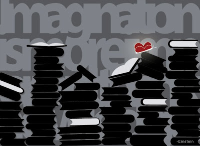
.jpg) Here's the final piece for Inspire Me Thursday's subject of "Einstein." To see the progression look below. There isn't too much change between the three.
Here's the final piece for Inspire Me Thursday's subject of "Einstein." To see the progression look below. There isn't too much change between the three.Again, the quote is:
"Imagination is more important than knowledge.- Einstein
.jpg) Here's the final piece for Inspire Me Thursday's subject of "Einstein." To see the progression look below. There isn't too much change between the three.
Here's the final piece for Inspire Me Thursday's subject of "Einstein." To see the progression look below. There isn't too much change between the three..jpg)
.jpg) The Einstein quote behind reads, "Imagination is more important than knowledge.- Einstein
The Einstein quote behind reads, "Imagination is more important than knowledge.- Einstein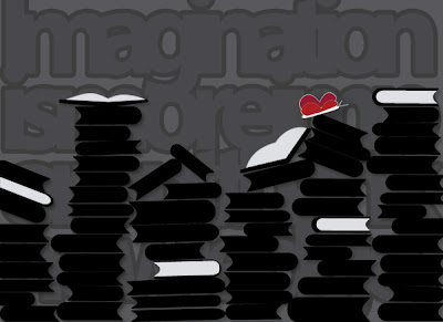.jpg)
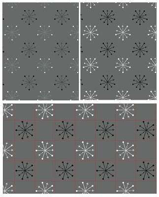 I'm working on snowflake patterns for my winter digital work. There will be a lot of these in Craft Amor's future.
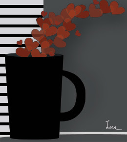.jpg) This week's theme at Inspire Me Thursday is "coffee break."
This week's theme at Inspire Me Thursday is "coffee break."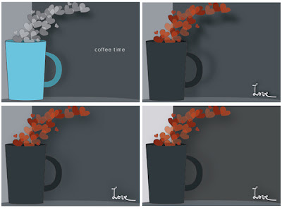 Here's the evolution of what I worked on today for Inspire Me Thursday.
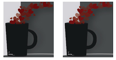 I don't like:
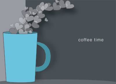.jpg) The Inspire Me Thursday's theme is "Coffee Break." Here's my first graphic although I'm not going to link until I've thought about it a wee bit. I like the heart steam but I'm not sure about the colors or the text. I look at it and sort of think, "What's the point of looking at this?"
The Inspire Me Thursday's theme is "Coffee Break." Here's my first graphic although I'm not going to link until I've thought about it a wee bit. I like the heart steam but I'm not sure about the colors or the text. I look at it and sort of think, "What's the point of looking at this?"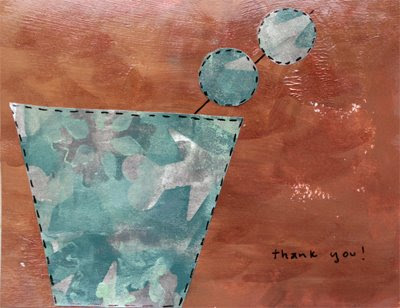 I made both of the papers used here. When I thought about combining them for a card the cup paper was blue in my mind. Blue and silver...because those are the paints I used. Yet when I glued it down against the copper brown color it seems very green. Green isn't bad but it has this camouflage feel that is a bit confusing. As in, "Why is my martini ready for hunting season and what does this have to do with thanks?"
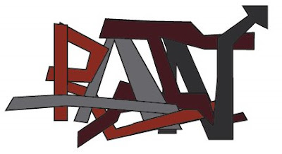.jpg) I can never spell "graffiti" right. I have to spell check it every time.
I can never spell "graffiti" right. I have to spell check it every time.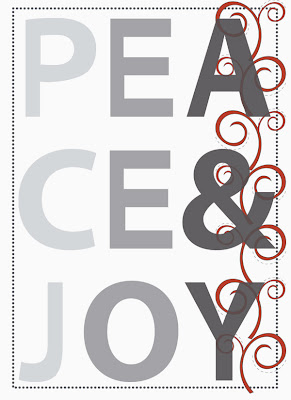.jpg)
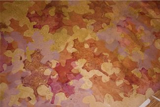
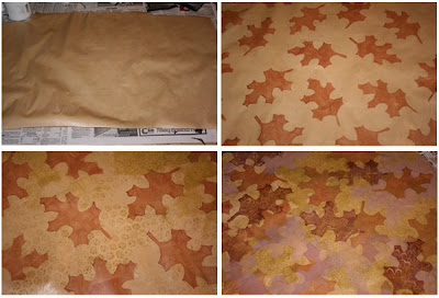 Last night I worked on paper for autumn cards. I like how the paper turned out but realized the leaf print was too large for cards. It wouldn't read on a 4x6" area.
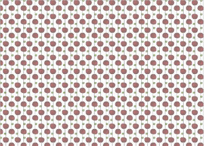.jpg) This pattern is in exact opposition to what I'm seeing outside of my office window today. It's cold. It's dark. It's blustery and wet. September and October were some of the prettiest I've ever seen here in Oregon. November might just let us have it.
This pattern is in exact opposition to what I'm seeing outside of my office window today. It's cold. It's dark. It's blustery and wet. September and October were some of the prettiest I've ever seen here in Oregon. November might just let us have it.