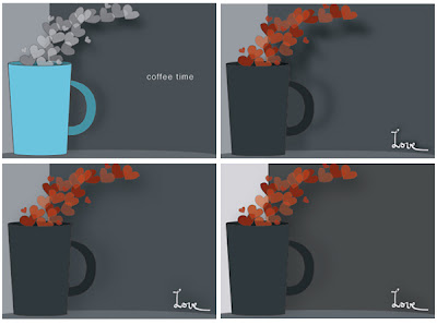
 Here's the evolution of what I worked on today for Inspire Me Thursday.
I took the McJumpquez's comment and added color to the steam. I have them red for love but the reds aren't translating well from my Photoshop file to the web conversion. I'm still mastering opacity so that's part of it.
I like:
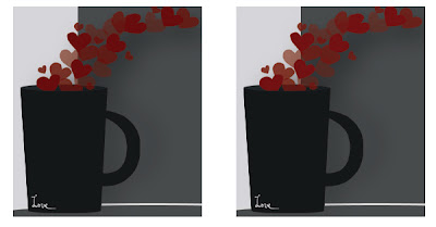
I like the more dramatic values of the squares. I'm still deciding if I like squarer shape, and I'm leaning toward yes. I like the love in the base of the cup. I like how it creates the corner. Also the white line running behind the mug added a lot and helps the lettering placement make visual sense.
 I don't like:
The color and value (but I think mostly value) of the steam hearts makes them hard to see. The cup jumps because it's an 8 while the dark hearts are almost the same value as the dark gray on the right. I prefer the hearts' hue in the bottom images, but the orange hearts stand out better.
I need to repeat the black somewhere or cut off an edge of the cup. I tried cropping the cup edge and it makes the image unbalanced. However the big block of an 8 value grabs focus instead of the steam. It's amazing actually that even though the hearts are red they command less attention than that (almost) black mug. Oh the power of Values.
(click for larger images)


No comments:
Post a Comment