(web).jpg)
(web).jpg)
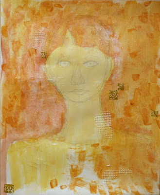
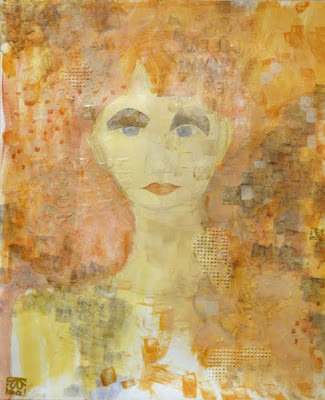
Here's something I worked on last night. I like it better on the computer than I do in real life. In real life it seems too light. I need to make it darker but I'm not exactly sure how.
I think in my next try on a different piece I will try to create texture all across the page (face and background) and then mask out the background or then hit it with more colors and texture. On this piece I painted in the face and then worked up the background texture but after adding to the background, the face looked completely mismatched with the activity going on behind it.
Also, I should say that it was great being able to use things I'd learned in Ann Baldwin's 2nd DVD ("Text and Texture in Mixed Media Collage") in a way that wasn't necessarily exactly what she was teaching. That's a big step for me. Also made me realize I need to review the individual techniques in that b/c I was having trouble remembering the different times Ann suggests using molding paste vs heavy gel gloss.


2 comments:
Nice Kel. Have you considered getting something to color balance your monitor? The XRite Eye-One works really well. I use it at work and it makes a big difference in viewing photographs accurately. It would probably help with your problem of the image looking better on the computer than in real life.
http://www.mwave.com/mwave/skusearch_v3.asp?scriteria=BA32312
That's not the best price I've seen, so shop around if you decide to get one.
Ooooh. Interesting. I'll look into this. Thanks Murray!
Post a Comment